This entry discusses colour brightness in relation to the HSB colour model, where H represents hue, S represents saturation, and B represents brightness.
Colour brightness can be understood as the variation in how a colour is perceived by an observer under well-lit conditions compared to its more muted appearance when in shadow or under poor illumination.
About colour brightness
- In this resource, the term colour brightness is used to describe how things appear to a human observer in terms of their perception of colour.
- Colour is what humans perceive in the presence of radiated or reflected light.
- The brightness of the colour of an object or surface (colour brightness) depends on the wavelengths and intensity of light that illuminate it and the amount of light it reflects.
- The colour brightness of a transparent or translucent medium may be influenced by the wavelengths and intensity of light that pass through or reflect off it and the amount it transmits or reflects.
- Colour brightness is frequently influenced by the contrast between how a colour appears to an observer under well-lit conditions and its more subdued appearance when in shadow or under poor illumination.
- The perception of colour brightness is also influenced by hue, as certain hues appear brighter than others to human observers. For example, a fully saturated yellow may appear relatively brighter than a fully saturated red or blue.
About colour models
A colour model derived from colour theory enables a more precise and reproducible method of representing and working with colour.
- Colour models are a practical application of colour theory that establish terms, definitions, rules or conventions, and systems of notation for encoding colours and their relationships to one another.
- These days, the most practical colour models are built into applications such as Adobe Creative Cloud and allow seamless digital output to TVs, computers, phones, or printing onto paper and other surfaces.
- Understanding colour models and utilizing them effectively can contribute to maintaining consistent and accurate colour reproduction across various media.
- Widely used colour models include:
- In addition to the colour models mentioned above, numerous other models are used in specific contexts, such as the Lab colour model employed in printing or the LCH colour model used in digital image processing.
A colour model is a framework that allows us to:
- Make sense of colour in relation to human vision, the surrounding world, and various media and technologies.
- Understand the relationship between different colours and their properties.
- Mix specific colours from other colours to achieve predictable and desired results.
- Specify colours using names, codes, notations, equations, and other forms of representation.
- Organise and utilize colour for different purposes, such as design, visual arts, or scientific applications.
- Use colours in consistent and repeatable ways across different platforms and media.
- Develop systems and rules for blending and using different media, such as light, pigments, or inks.
- Create colour palettes, define gamuts, and establish colour guides to guide artistic or design decisions.
About brightness & colour models
- The term brightness is often used in association with a specific colour model.
- Examples of colour models include:
- The HSB colour model uses the term brightness alongside hue and saturation.
- Some colour models don’t use the term brightness at all, so when we change from one colour model to another it’s best to change our terminology as well.
About colour theory
Colour theories underpin colour management by seeking to explain how human beings perceive colour and establish the rational basis for practical how-to methods for managing colour in different situations.
A system of colour management may be associated with:
-
- A colour theory
- A colour model
- Colour notation
- A colour space
- Colour wheel/s, colour picker/s
- Colour swatch/es, colour sample/s
- Colour profile/s for digital workspaces, monitors, printers etc.
Colour theory and human perception
The aspect of colour theory concerned with the human perception of colour aims to answer questions about:
- How our eyes register colour when exposed to light.
- The way our eyes and brains work together to produce the complex colour perceptions that make up the visible world.
- The part of the electromagnetic spectrum that is related to colour and how our eyes respond to different wavelengths of light.
- The fact that red, green and blue lights combined in different proportions can produce the impression of all the colours of the visible spectrum.
- The way colours appear in different situations such as in low or bright light and under artificial lighting.
- Human responses to different combinations of colour such as analogous, complementary and contrasting colours.
- The differences between the scientific, technical and creative understandings and descriptions of colour.
- Understanding the differences between:
- The way our eyes see colour
- Light and colour in the world around us
- The colour of opaque objects and surfaces
- The colour of transparent media
- Colour on TVs, computers and phone screens
- Colour in printed images
Colour theory and colour management
The aspect of colour theory concerned with how-to methods for managing colour in different situations aims to answer questions about:
- The differences between mixing coloured lights, pigment or inks.
- Mixing and managing ranges (gamuts) of colours in logical, predictable and repeatable ways.
- Identifying and mixing particular colours in predictable and repeatable ways.
- Specifying colours using names, codes, notation, equations etc.
- The difference between additive and subtractive colour mixing.
- Systems and rules for mixing different and applying them to different materials such as fabrics, interiors and vehicles.
- Creating colour palettes, gamuts and colour guides.
- Managing the consistent reproduction of digital colour from start to finish.
Where to find colour theories
- Trichromatic colour theory
- Opponent colour theory
- Neurological research
- Subtractive and additive theories of colour
- The Munsell colour system
- LAB colour model
- Spectral colour model
- RGB colour model
- HSB colour model
- CMY colour model
- Pantone Matching System (PMS) is a standardised system for the colour printing industry.
- RAL classic colour system is used mainly for powder coating, varnish, and plastic colouring.
About the HSB colour model
The HSB colour model is an additive colour model used to mix light (subtractive colour models are used to mix pigments and inks).
- The main difference between the HSB colour model and the RGB colour model is how colours are represented and managed in software and applications.
- The HSB model represents colours based on hue, saturation, and brightness, whereas the RGB model mixes red, green, and blue light to create colours.
- HSB is popular because it provides a user-friendly way to select and modify colours when using applications like Adobe Creative Cloud for design, photography, or web development.
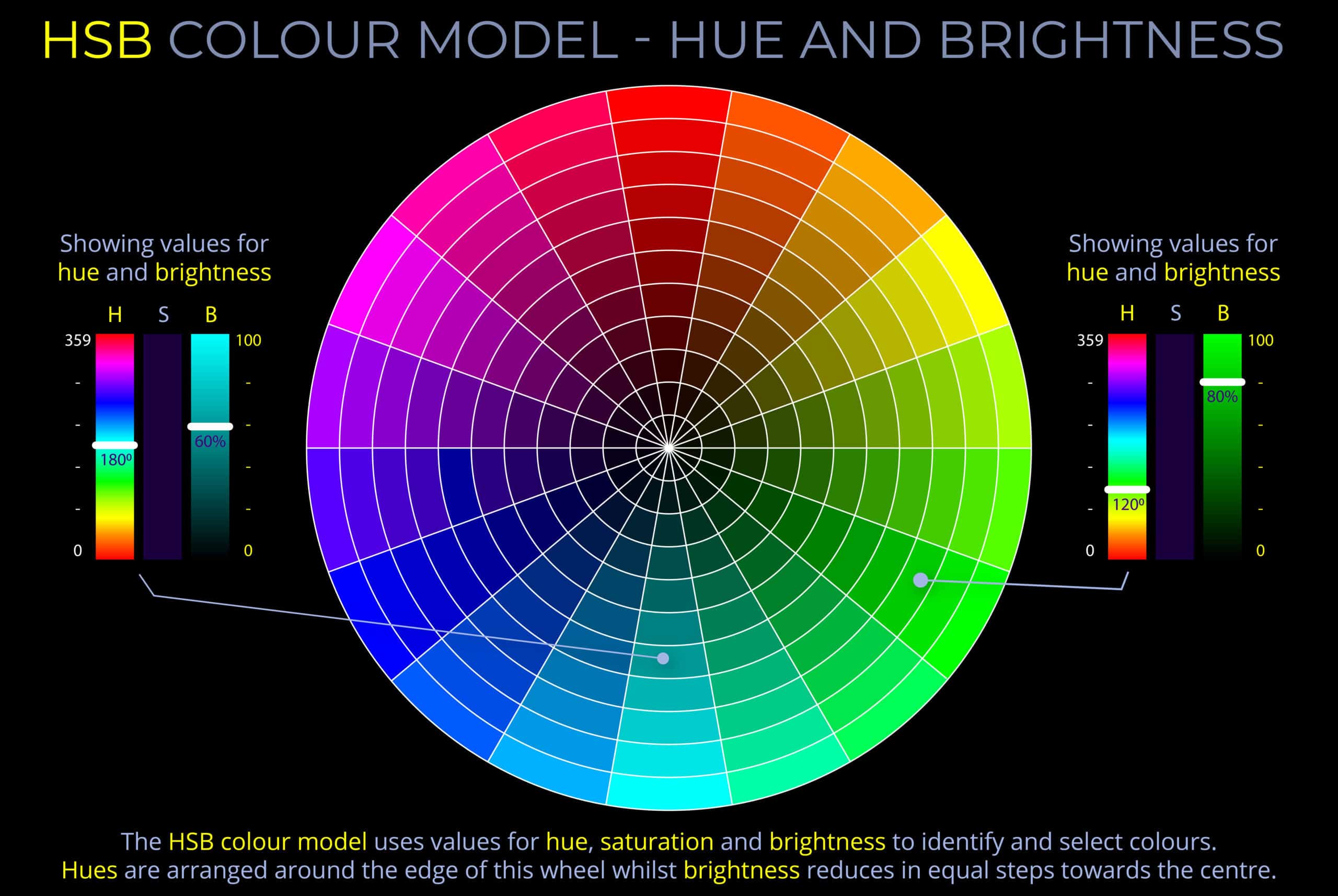
- On HSB colour wheels, saturation typically increases from the centre towards the edge.
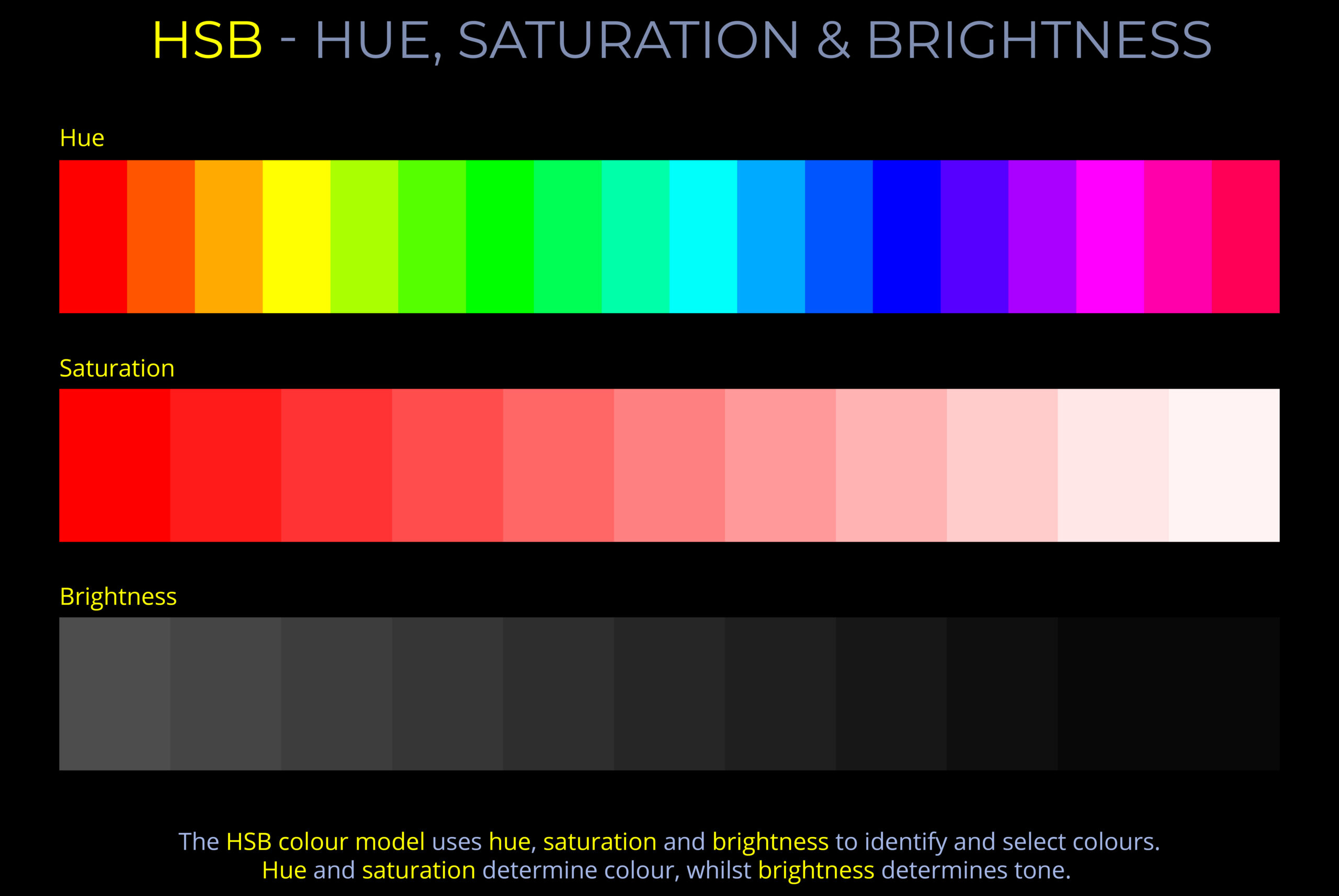
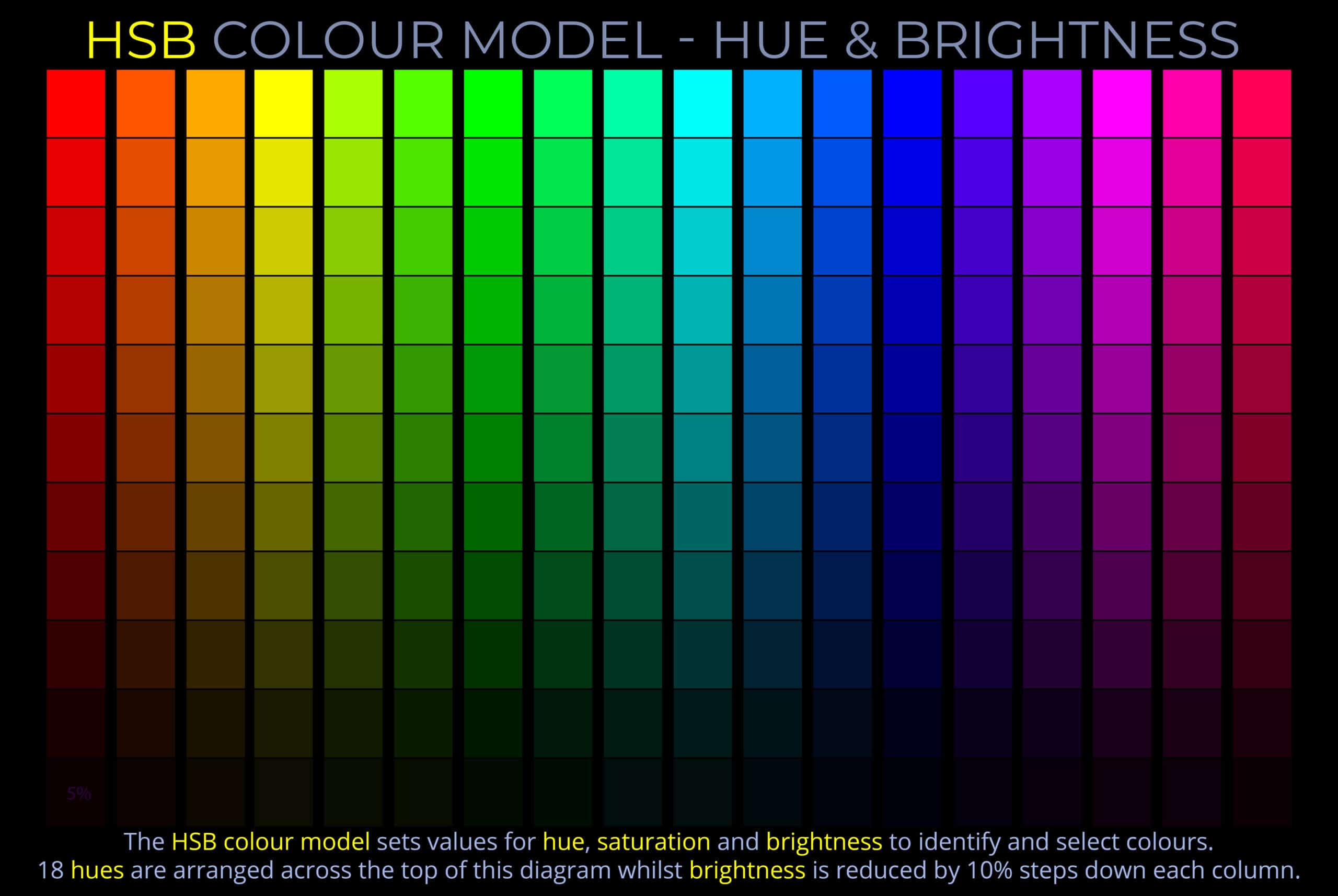
In the HSB colour model:
- Hue refers to the perceived difference between colours and is usually described using names such as red, yellow, green, or blue.
- Hue can be measured as a location on an HSB colour wheel and expressed as a degree between 0 and 360.
- Saturation refers to the vividness of a colour compared to an unsaturated colour.
- Saturation is measured between a fully saturated colour (100%) and an unsaturated colour (0%)that appear either:
- Dull and washed out until all colour disappears, leaving only a monochromatic grey tone (0%).
- Misty or milky the nearer they are to white.
- On many HSB colour wheels, saturation decreases from the edge to the centre.
- Saturation is measured between a fully saturated colour (100%) and an unsaturated colour (0%)that appear either:
- Brightness refers to the perceived difference in the appearance of colours under ideal sunlit conditions compared to poor lighting conditions where a hue’s vitality is lost.
- Brightness can be measured as a percentage from 100% to 0%.
- As the brightness of a fully saturated hue decreases, it appears progressively darker and achromatic.
About colour brightness & light intensity
- The perception of colour depends on the wavelengths that reach an observer’s eyes. Red has a longer wavelength, while violet has a shorter wavelength.
- Any colour (e.g. red, magenta, or violet) can be defined by its hue, saturation, and brightness.
- Saturated colours are produced by a single wavelength of light or a narrow band of wavelengths.
- The brightness of a colour depends on the intensity of the light emitted by a light source (e.g., a coloured light bulb) and the amount of light reflected from a coloured surface.
- So, for example, the texture of a surface can affect brightness even when the intensity of the light source remains constant.
- The intensity of light, along with factors such as phase and interference, are directly related to the amplitude of an electromagnetic wave.
- Amplitude measures the height of light waves from the centre-line of a waveform to its crest or to a corresponding trough.
- Colour brightness, light intensity, and the amplitude of a light wave can all be thought of in terms of the number of photons that strike the eye of an observer.
Related diagrams
Each diagram below can be viewed on its own page with a full explanation.


- Colour brightness can be understood as the variation in how a colour is perceived by an observer under well-lit conditions compared to its more muted appearance when in shadow or under poor illumination.
- Follow this link for a discussion of colour brightness in relation to the HSB colour model, where H represents hue, S represents saturation, and B represents brightness.