HSB Colour Model – Wedges
£0.00
This diagram is a new addition to the site! More information will be added ASAP 🙂
Description
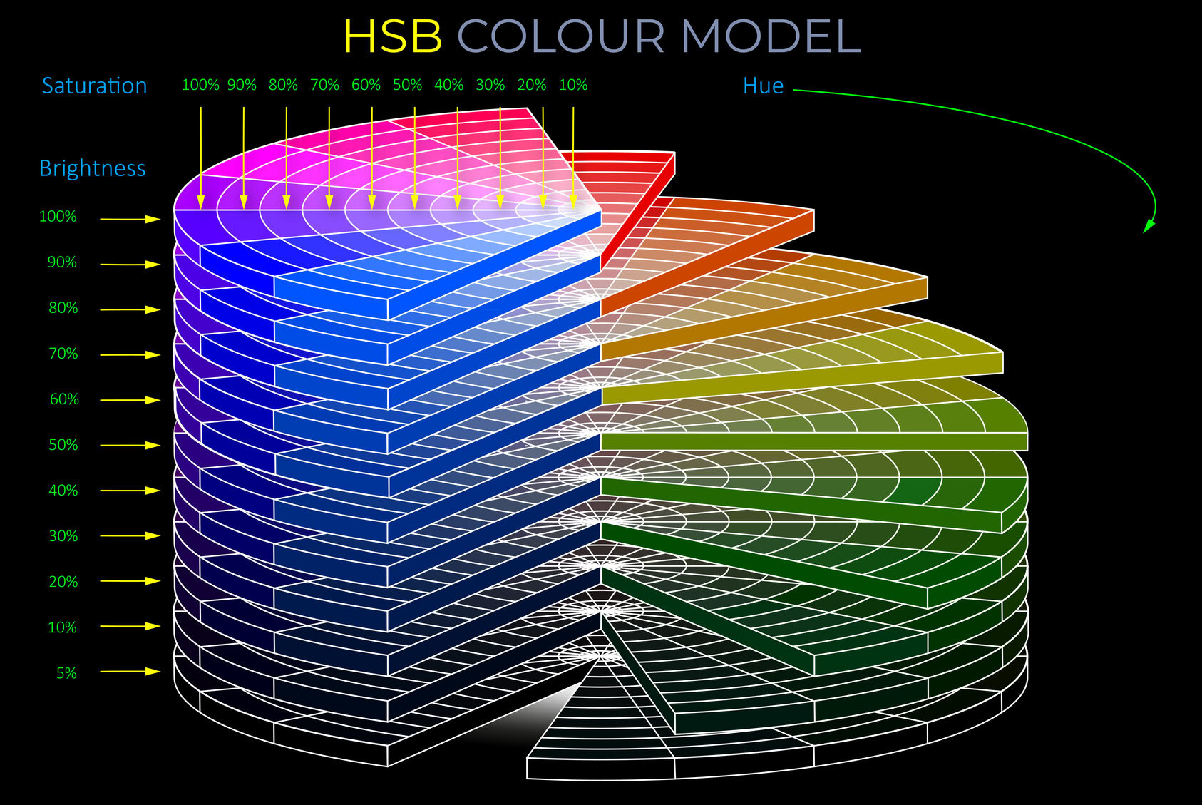
HSB Colour Model - Wedges
About the diagram
Some key terms
The HSB colour model is similar to the RGB colour model insofar as it is an additive model based on RGB primary colours.
- Both RGB and HSB are additive colour models with red, green and blue primary colours. But whilst RGB relies on directly adjusting the amount of red, green and blue light needed to produce other colours the HSB colour model relies on adjusting hue, saturation and brightness.
- Hue refers to the perceived difference between colours and is usually described using names such as red, yellow, green, or blue.
- Hue can be measured as a location on an HSB colour wheel and expressed as a degree between 0 and 360.
- Saturation refers to the vividness of a colour compared to an unsaturated colour.
- Saturation is measured between a fully saturated colour (100%) and an unsaturated colour (0%)that appears either:
- Dull and washed out until all colour disappears, leaving only a monochromatic grey tone (0%).
- Misty or milky the nearer they are to white.
- On many HSB colour wheels, saturation decreases from the edge to the centre.
- Saturation is measured between a fully saturated colour (100%) and an unsaturated colour (0%)that appears either:
- Brightness refers to the perceived difference in the appearance of colours under ideal sunlit conditions compared to poor lighting conditions where a hue’s vitality is lost.
- Brightness can be measured as a percentage from 100% to 0%.
- As the brightness of a fully saturated hue decreases, it appears progressively darker and achromatic.
Saturation refers to the perceived difference between one colour and another in terms of its purity and vividness.
- A fully saturated colour appears bright and vibrant because it has a single strong dominant hue.
- A freshly cut tomato is a good example of a saturated colour with a strong red hue.
- A saturated colour is a unique spectral colour produced by a single wavelength (or a narrow band of wavelengths) of light.
- A fully saturated colour (100%) is the purest version of a hue.
- Unsaturated colours (0-10%) can appear:
- Misty or milky the nearer they are to white.
- Dull and washed out as their hue disappears leaving achromatic grey tones.
- The hue of a vivid colour appears to be at full strength and can leave an after-image of its complementary colour as an observer looks away.
The terms brightness and colour brightness have distinct meanings. The first refers to a property of light, and the second to a property of colour as detailed below.
- Brightness (as opposed to colour brightness) is used to refer to a property of light.
- Colour brightness is used to refer to how much colour something appears to emit or reflect towards an observer.
- Colour brightness can be understood as the variation in how a colour is perceived by an observer under well-lit conditions compared to its more muted appearance when in shadow or under poor illumination.
- In the HSB colour model:
- Hue refers to the perceived difference between colours and is usually described using names such as red, yellow, green, or blue.
- Saturation refers to the vividness of a colour compared to an unsaturated colour.
- Brightness refers to the perceived difference in the appearance of colours under ideal sunlit conditions compared to poor lighting conditions where a hue’s vitality is lost.
- Brightness can be measured as a percentage from 100% to 0%.
- As the brightness of a fully saturated hue decreases, it appears progressively darker and achromatic.
A colour model is a system or framework used to understand, organise, and manipulate colour. It ranges from basic concepts, such as the sequence of colours in a rainbow, to more advanced models like RGB, CMYK, and CIE, which are essential for accurate colour reproduction in various fields, including digital media, printing, and manufacturing.
- A colour model, underpinned by colour theory, provides a precise and replicable approach to understanding:
- How the human eye perceives light and interprets colour.
- Different types of colour, including those produced by mixing lights, pigments, or inks.
- How to manage the diverse ways colour is processed by devices such as cameras, digital screens, and printers.
- Colour models enable us to:
- Make sense of colour in relation to human vision and the world around us.
- Use colours in logical, predictable, and replicable ways.
- Understand how to mix specific colours, whether using lights, pigments, inks, or dyes.
- Specify colours using names, codes, notations, or equations.
- Organise and apply colour for different purposes, from fabrics and interiors to vehicles.
- For more information see https://lightcolourvision.org/dictionary/definition/colour-model/
The terms brightness and colour brightness have distinct meanings. The first refers to a property of light, and the second to a property of colour as detailed below.
- Brightness (as opposed to colour brightness) is used to refer to a property of light.
- Colour brightness is used to refer to how much colour something appears to emit or reflect towards an observer.
- When brightness is used in connection with the HSB colour model it is used alongside hue and saturation and refers to the method of selecting and adjusting colours in software applications such as Adobe Illustrator.
- The HSB colour model is a representation of colours that combines hue, saturation, and brightness components.
- In the HSB brightness represents the intensity or lightness of a colour, with higher values indicating brighter or lighter colours.
HSB colour values (codes) are numeric triplets used in software applications and programming to identify different colours.
- A numeric triplet is a code containing three parameters that refer to the hue, saturation, and brightness of a colour.
- For example:
- The HSB values for pure red are(0, 100%, 100%): Hue: 0°, Saturation: 100%, Brightness: 100%.
- A lighter, pastel version of red might be (0, 50%, 100%): Hue: 0°, Saturation: 50%, Brightness: 100%.
- A very dark, muted red could be: Hue (0, 100%, 20%): 0°, Saturation: 100%, Brightness: 20%.
- The values assigned to the three parameters can be used to define millions of different colours.
- Typically, the HSB colour model is implemented as follows:
- Hue is represented in degrees from 0 to 360, corresponding to locations on the circumference of a colour wheel.
- Saturation is represented as a percentage, where 100% denotes a fully saturated colour, and 0% denotes a fully desaturated colour.
- Brightness is represented as a percentage, where 100% denotes the highest luminance of a colour, and 0% denotes the darkest possible shade of a colour.
Hue is one of the three main properties of colour, alongside saturation and brightness and is described using names such as red, yellow, green or blue.
- Hue refers to the colour of an object or light source, and is determined by the dominant wavelength of light it emits or reflects.
- Hue is often used to describe colours in terms of their position on the colour wheel. Colour wheels are circular diagrams that arrange colours according to their hue.
- The most commonly used colour wheel is the RGB colour wheel, which includes primary colours (hues) of red, green and blue, as well as secondary and tertiary colours.
- Hues can be warm or cool, depending on their position on the colour wheel. Warm hues are those that include red, orange and yellow, while cool hues include blue, green and purple.
- The perceived brightness and saturation of a hue can be affected by its surrounding colours, as well as by lighting conditions.
- The perception of hue is also influenced by cultural and personal associations, as well as context and other environmental factors.


