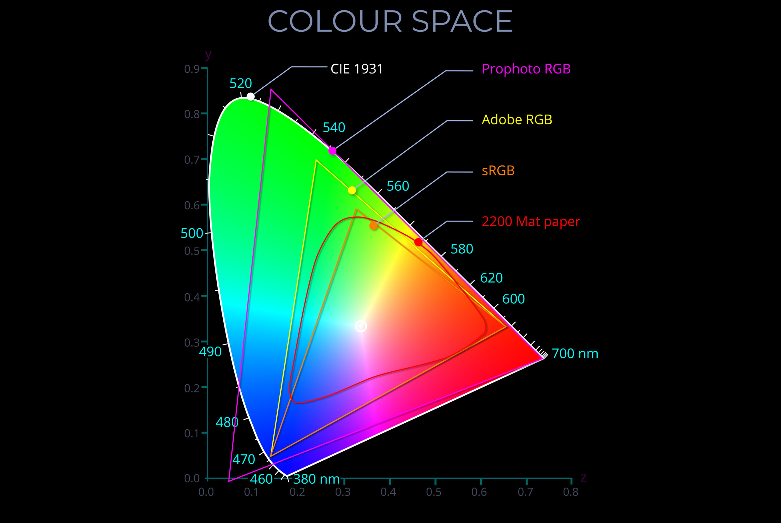
A chromaticity diagram is a two-dimensional visual depiction of all the colours produced by mixing specific primary colours in a particular colour model.
-
- This means it shows the range of colours achievable by combining red, green, and blue light in varying proportions, not all possible colours imaginable. Some chromaticity diagrams may include colours that are technically visible under specific conditions (e.g., high intensity) but are not typically seen by humans under normal viewing conditions.
- The two axes in a chromaticity diagram, typically labelled x and y, represent the proportions of red, green, and blue light needed to produce a specific colour within the model’s gamut.
- The most common diagrams, like the CIE 1931 xy diagram, display the entire range of hues (at varying levels of saturation) that a human observer can perceive under ideal conditions.
- The scale on each axis of chromaticity diagrams used for technical purposes aligns with the range of colour values (chromaticity coordinates) described by the CIE (1931) XYZ colour space. This enables them to accurately depict colour spaces in a manner consistent with a comprehensive and internationally recognized chromaticity coordinate system.
- Some chromaticity diagrams show the smaller range of other colour spaces so that the range of colours that can be reproduced by equipment such as cameras, digital screens and printers can be compared.
- Chromaticity diagrams are used to:
- Ensure predictable, consistent and accurate colour reproduction across different devices and platforms.
- Compare the chromaticity of colours, and so determine the difference between the appearance of particular colours or ranges of colour in terms of hue and saturation.
- Assess and optimize the performance of equipment and materials used for colour reproduction.
Chromaticity diagram description
- The colours in a chromaticity diagram appear on a horseshoe-shaped block positioned between two axes and taken as a whole, represents the entire range of colours a person with average eyesight perceives.
- Each point within the horseshoe signifies the position of a unique spectral colour in terms of its hue and saturation.
- In theory, a high-quality HD display can show a chromaticity diagram containing over 16 million colours.
- The scales on the x and y axes can be used to plot the component RGB values associated with any colour.
- As the values increase along the x-axis, the amount of blue in a colour decreases as red increases.
- As the values increase along the y-axis, the amount of blue in a colour decreases as green increases.
- As values increase along both the x and y axis the diagram locates every possible colour.
- Fully saturated colours appear along the boundary of the horseshoe and every pixel corresponds with the wavelength of a single spectral colour measured in nanometres.
- The fully saturated spectral colours along the boundary become less saturated towards the centre of the diagram.
- The circle in the centre, the white point, indicates the point where amounts of red, green and blue add together to produce a neutral white.
- The white point represents the appearance of natural light at midday.
- Two-dimensional chromaticity diagrams don’t show the z-axis which corresponds with colour brightness.
Related diagrams
Each diagram below can be viewed on its own page with a full explanation.


References
- A chromaticity diagram is a two-dimensional visual depiction of all the colours produced by mixing specific primary colours in a particular colour model.
- This means it shows the range of colours achievable by combining red, green, and blue light in varying proportions, not all possible colours imaginable. Some chromaticity diagrams may include colours that are technically visible under specific conditions (e.g., high intensity) but are not typically seen by humans under normal viewing conditions.
- The two axes in a chromaticity diagram, typically labelled x and y, represent the proportions of red, green, and blue light needed to produce a specific colour within the model’s gamut.
- The most common diagrams, like the CIE 1931 xy diagram, display the entire range of hues (at varying levels of saturation) that a human observer can perceive under ideal conditions.
- The scale on each axis of chromaticity diagrams used for technical purposes aligns with the range of colour values (chromaticity coordinates) described by the CIE (1931) XYZ colour space. This enables them to accurately depict colour spaces in a manner consistent with a comprehensive and internationally recognized chromaticity coordinate system.
- Some chromaticity diagrams show the smaller range of other colour spaces so that the range of colours that can be reproduced by equipment such as cameras, digital screens and printers can be compared.