Colour space
£0.00
This diagram is a new addition to the site! More information will be added ASAP 🙂
Description
Colour space
TRY SOME QUICK QUESTIONS AND ANSWERS TO GET STARTED
About the diagram
ABOUT THE DIAGRAM
Some key terms
The term gamut or colour gamut is used to describe:
- The range of colours that a specific device or system can display or reproduce.
- The range of colours that the human eye can see in specific conditions.
- A range of colours that is smaller than all the colours that the human eye can see.
- All the colours in an image. Digitizing a photo, changing an image’s colour space, or printing an image onto paper might change its gamut.
- The range of perceived colours (visible to a human observer) is always greater than the range that can be reproduced by any digital device such as a screen, monitor or projector.
- Digital cameras, scanners, monitors, and printers all have limits to the range of colours they can capture, save, and reproduce.
- The main use of digital colour spaces and colour profiles is to set the gamut of colours that can be used to accurately reproduce or optimise the appearance of an image.
- It is currently impossible to make a digital device that can reproduce the same range of colours that the human eye can see.
An additive colour model explains how different coloured lights (such as LEDs or beams of light) are mixed to produce other colours.
- Additive colour refers to the methods used and effects produced by combining or mixing different wavelengths of light.
- The RGB colour model and HSB colour model are examples of additive colour models.
- Additive colour models such as the RGB colour model and HSB colour model can produce vast ranges of colours by combining red, green, and blue lights in varying proportions.
- An additive approach to colour is used to achieve precise control over the appearance of colours on digital screens of TVs, computers, and phones.
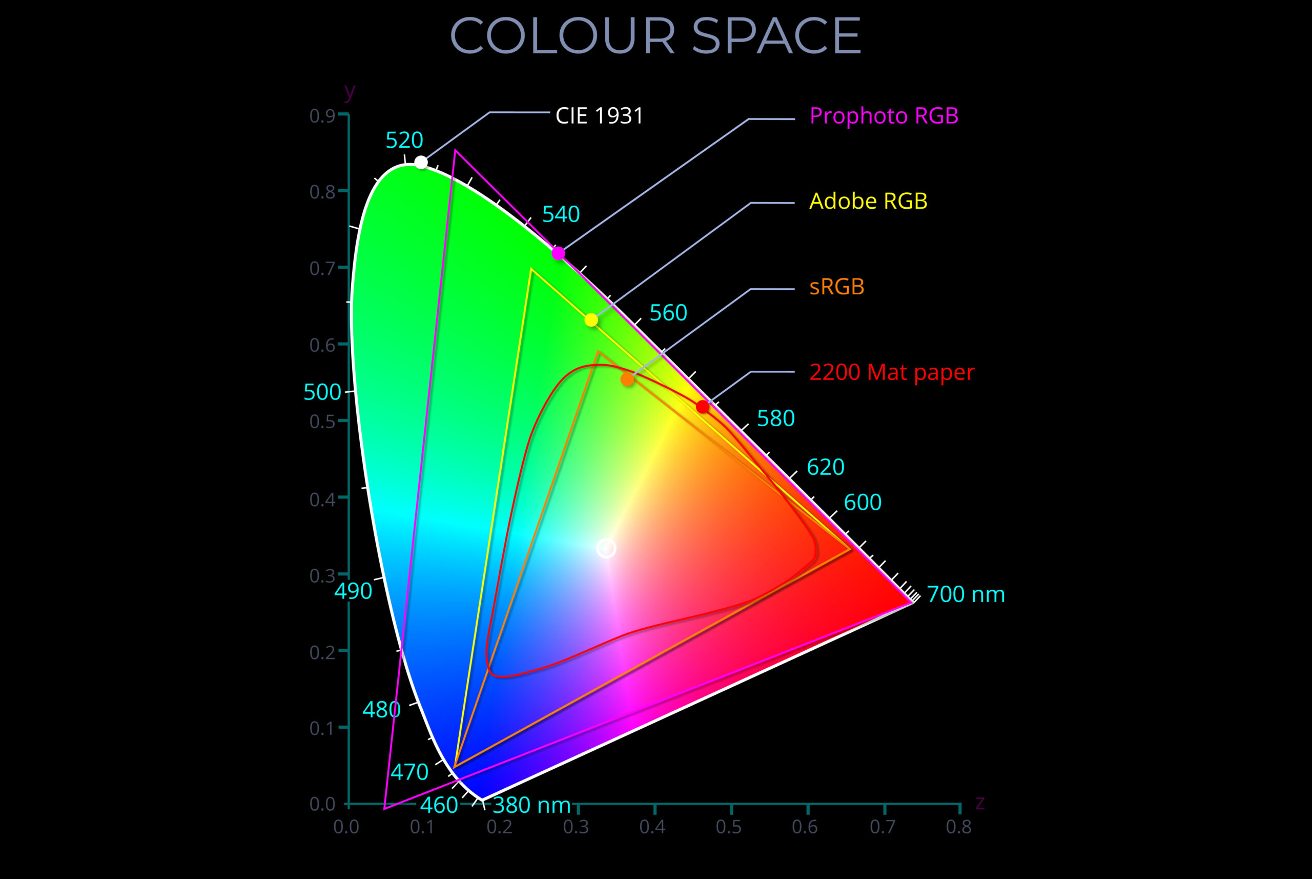
A chromaticity diagram is a two-dimensional visual depiction of all the colours produced by mixing specific primary colours in a particular colour model.
- This means it shows the range of colours achievable by combining red, green, and blue light in varying proportions, not all possible colours imaginable. Some chromaticity diagrams may include colours that are technically visible under specific conditions (e.g., high intensity) but are not typically seen by humans under normal viewing conditions.
- The two axes in a chromaticity diagram, typically labelled x and y, represent the proportions of red, green, and blue light needed to produce a specific colour within the model’s gamut.
- The most common diagrams, like the CIE 1931 xy diagram, display the range of hues (at varying saturation levels) that a human observer can perceive under ideal conditions.
- The scale on each axis of chromaticity diagrams used for technical purposes aligns with the range of colour values (chromaticity coordinates) described by the CIE (1931) XYZ colour space. This enables them to accurately depict colour spaces in a manner consistent with a comprehensive and internationally recognized chromaticity coordinate system.
- Some chromaticity diagrams show the smaller range of other colour spaces so that the range of colours that can be reproduced by equipment such as cameras, digital screens and printers can be compared.
- Chromaticity diagrams are used to:
- Ensure predictable, consistent and accurate colour reproduction across different devices and platforms.
- Compare the chromaticity of colours, and so determine the difference between the appearance of particular colours or ranges of colour in terms of hue and saturation.
- Assess and optimize the performance of equipment and materials used for colour reproduction.
Chromaticity refers to the characteristic of colour when described in terms of hue and saturation, rather than just its wavelength.
- Chromaticity refers to the quality of a colour that sets it apart from white, grey, or black.
- The chromaticity of different colours is often described by chromaticity coordinates that define where a colour appears within a colour space.
- The simplest way to understand chromaticity is through a chromaticity diagram that creates a two-dimensional visual display of all the colours produced by a specific colour space.
- A chromaticity diagram displays hue and saturation without mentioning their brightness.
- The most common chromaticity diagrams showcase the full range of colours visible to a human observer under ideal conditions. The position of each colour is plotted using the range of colour values (chromaticity coordinates) described by the CIE (1931) XYZ colour space.
- Some chromaticity diagrams illustrating the CIE (1931) XYZ colour space include overlays of the smaller gamuts of colour spaces associated with different mediums, lighting conditions, and devices.
- Examples of colour spaces with smaller gamuts than the CIE (1931) XYZ colour space include:
- Adobe RGB (1998)
- Prophoto RGB
- sRGB
- 2200 matt paper
A colour model is a system or framework used to understand, organise, and manipulate colour. It ranges from basic concepts, such as the sequence of colours in a rainbow, to more advanced models like RGB, CMYK, and CIE, which are essential for accurate colour reproduction in various fields, including digital media, printing, and manufacturing.
- A colour model, underpinned by colour theory, provides a precise and replicable approach to understanding:
- How the human eye perceives light and interprets colour.
- Different types of colour, including those produced by mixing lights, pigments, or inks.
- How to manage the diverse ways colour is processed by devices such as cameras, digital screens, and printers.
- Colour models enable us to:
- Make sense of colour in relation to human vision and the world around us.
- Use colours in logical, predictable, and replicable ways.
- Understand how to mix specific colours, whether using lights, pigments, inks, or dyes.
- Specify colours using names, codes, notations, or equations.
- Organise and apply colour for different purposes, from fabrics and interiors to vehicles.
- For more information see https://lightcolourvision.org/dictionary/definition/colour-model/
Diagrams are free to download
Related products
-

Why an Object Appears Yellow
£0.00 Select options This product has multiple variants. The options may be chosen on the product page -

R G & B Lights on a Dark Surface
£0.00 Select options This product has multiple variants. The options may be chosen on the product page -

Why an Object Appears Red
£0.00 Select options This product has multiple variants. The options may be chosen on the product page