In the context of a discussion of light, complementary colours are pairs of colours that, when mixed together, produce white and when placed next to each other appear to create the strongest possible contrast.
In the context of a discussion of paints and inks, complementary colours are pairs of colours that, when mixed together, produce a brown-purple-black colour and when placed next to each other appear to create the strongest possible contrast.
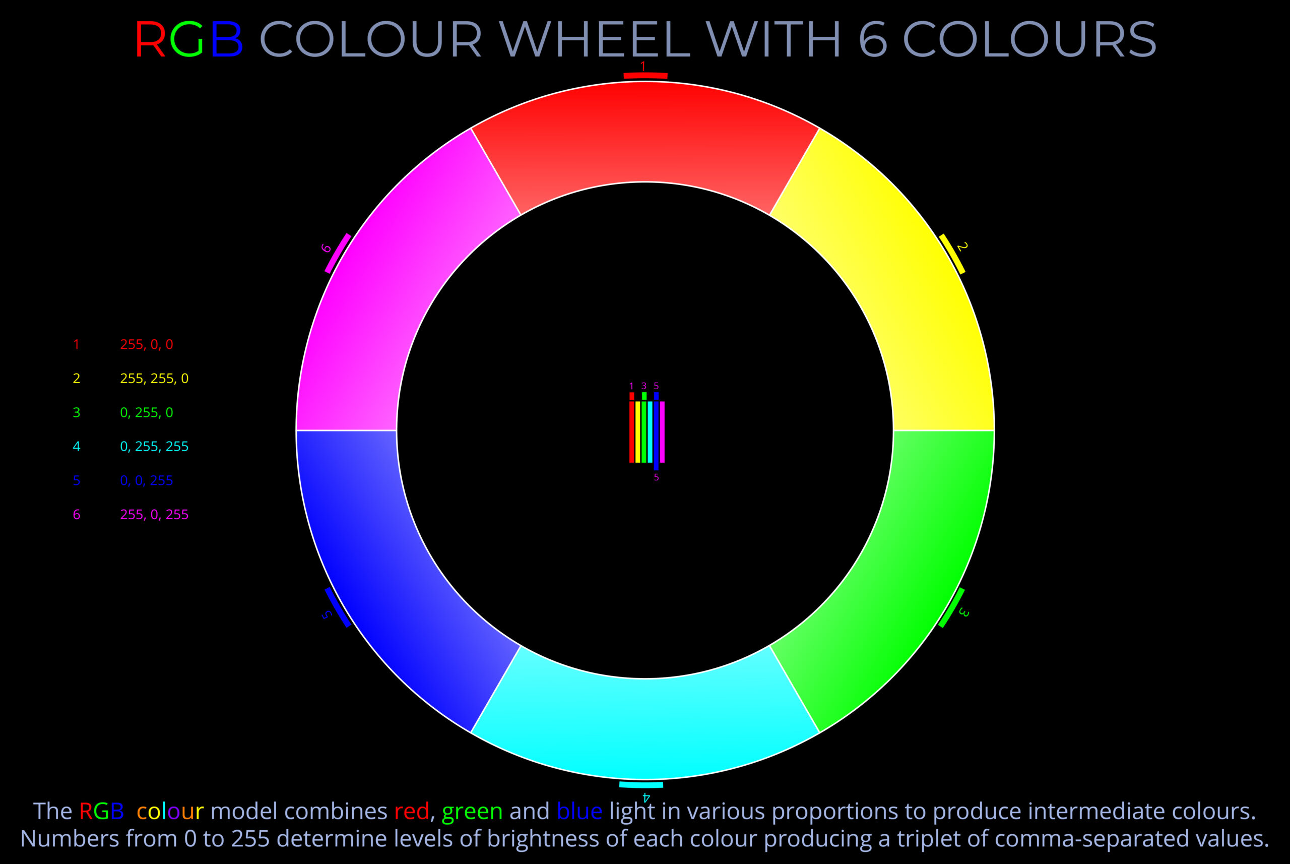
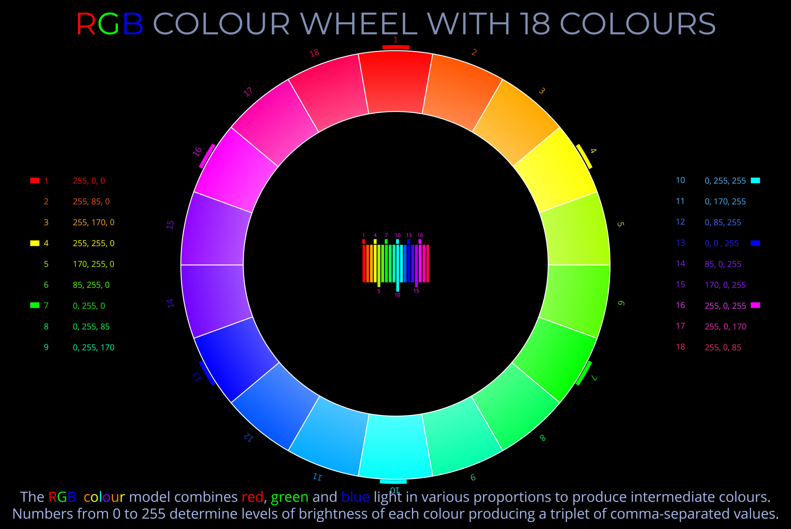
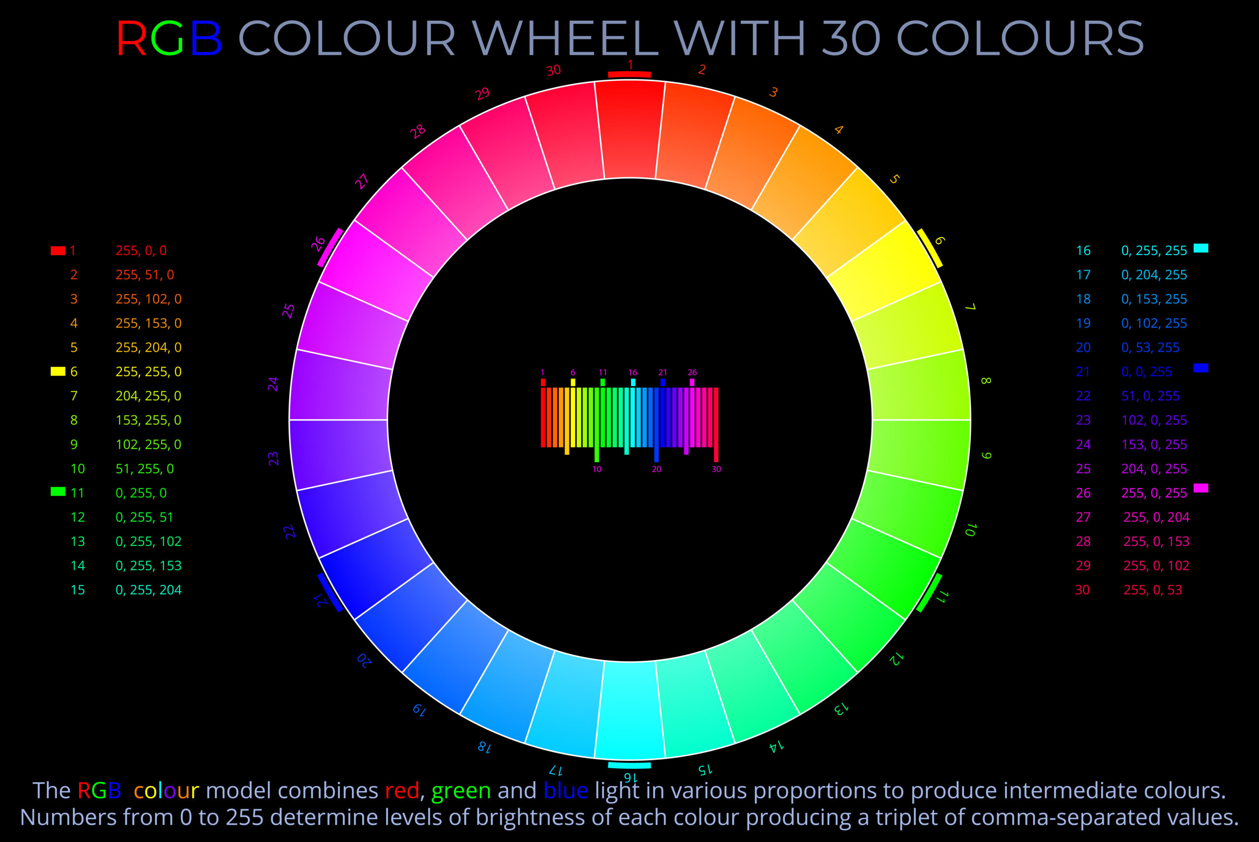
- Pairs of complementary colours always involve one primary colour and a secondary colour that are opposite one another on a colour wheel. The secondary colour on an RGB colour wheel or HSB colour wheel can always be produced by mixing the other two of the three primaries.
- Complementary colours always juxtapose one cool colour with a warm colour. Reds, oranges and yellows are the warm colours, while blues, greens, and purples are the cool colours.
- In the context of light, complementary colours result from the additive mixing of wavelengths of light. When all three primary colours are mixed they produce white.
- In the context of paints and inks, complementary colours result from the subtractive colour mixing of pigments. When all three primary colours are mixed they produce black.
- The mixing of pigments such as powder colours is more complex than mixing known wavelengths of light. When all three primary colours (cyan/magenta/yellow inks or red/yellow/blue powder colours) are mixed they often produce muddy brown or purple colours.
Related diagrams
Each diagram below can be viewed on its own page with a full explanation.


- In the context of a discussion of light, complementary colours are pairs of colours that, when mixed, produce white and when placed next to each other appear to create the strongest possible contrast.
- In the context of a discussion of paints and inks, complementary colours are pairs of colours that, when mixed, produce a brown-purple-black colour and when placed next to each other appear to create the strongest possible contrast.